VERONICA TSAI
Graphic Design & Illustration
Florence & the Machine:
Everybody Scream
Pride & Prejudice
20th Anniversary
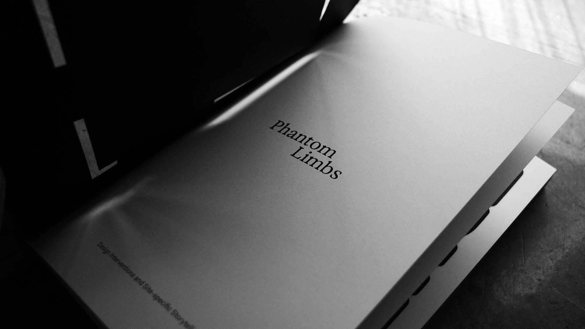
Phantom Limbs
MFA Thesis, Installation
The Power in Our Songs
Book Design, Installation
Playground
About
FLORENCE + THE MACHINE:
EVERYBODY SCREAM
PRIDE & PREJUDICE 20th Anniversary
Stay tuned my friends
PHANTOM LIMBS
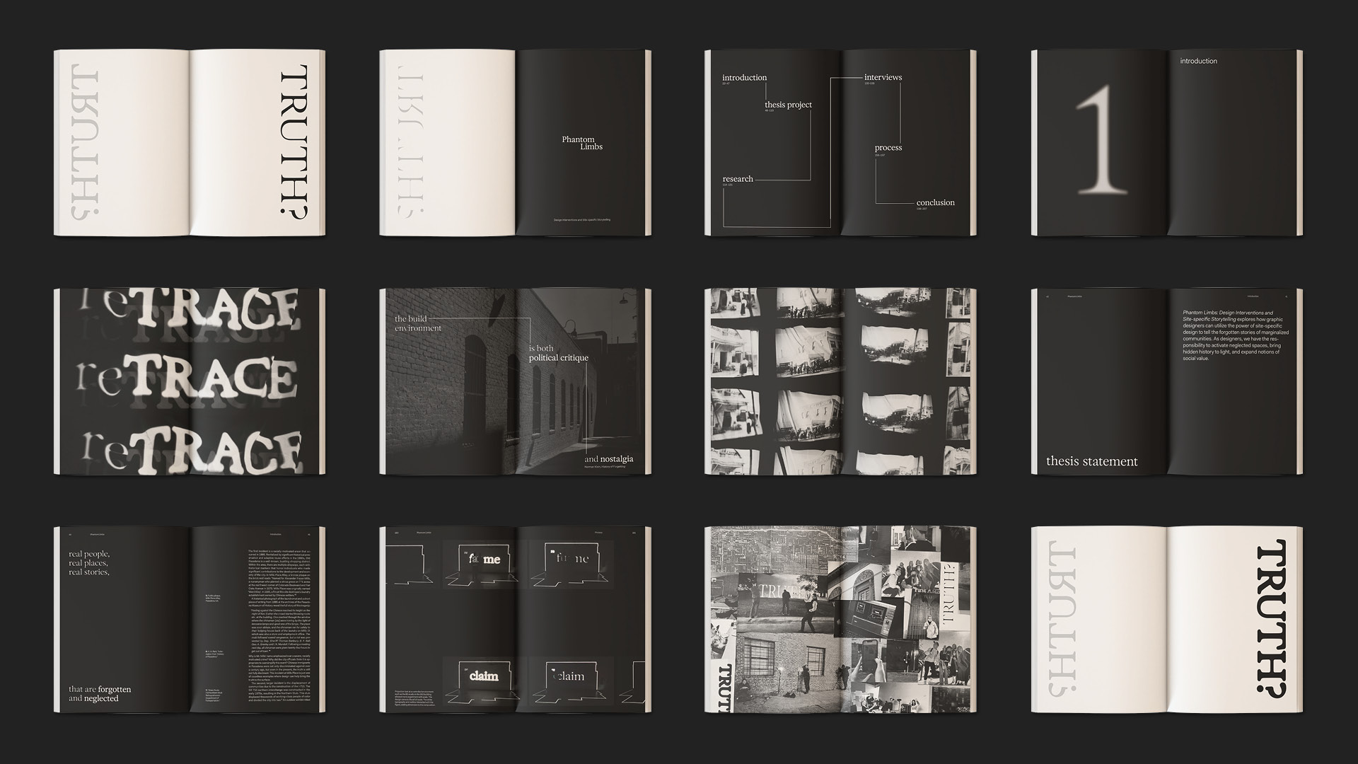
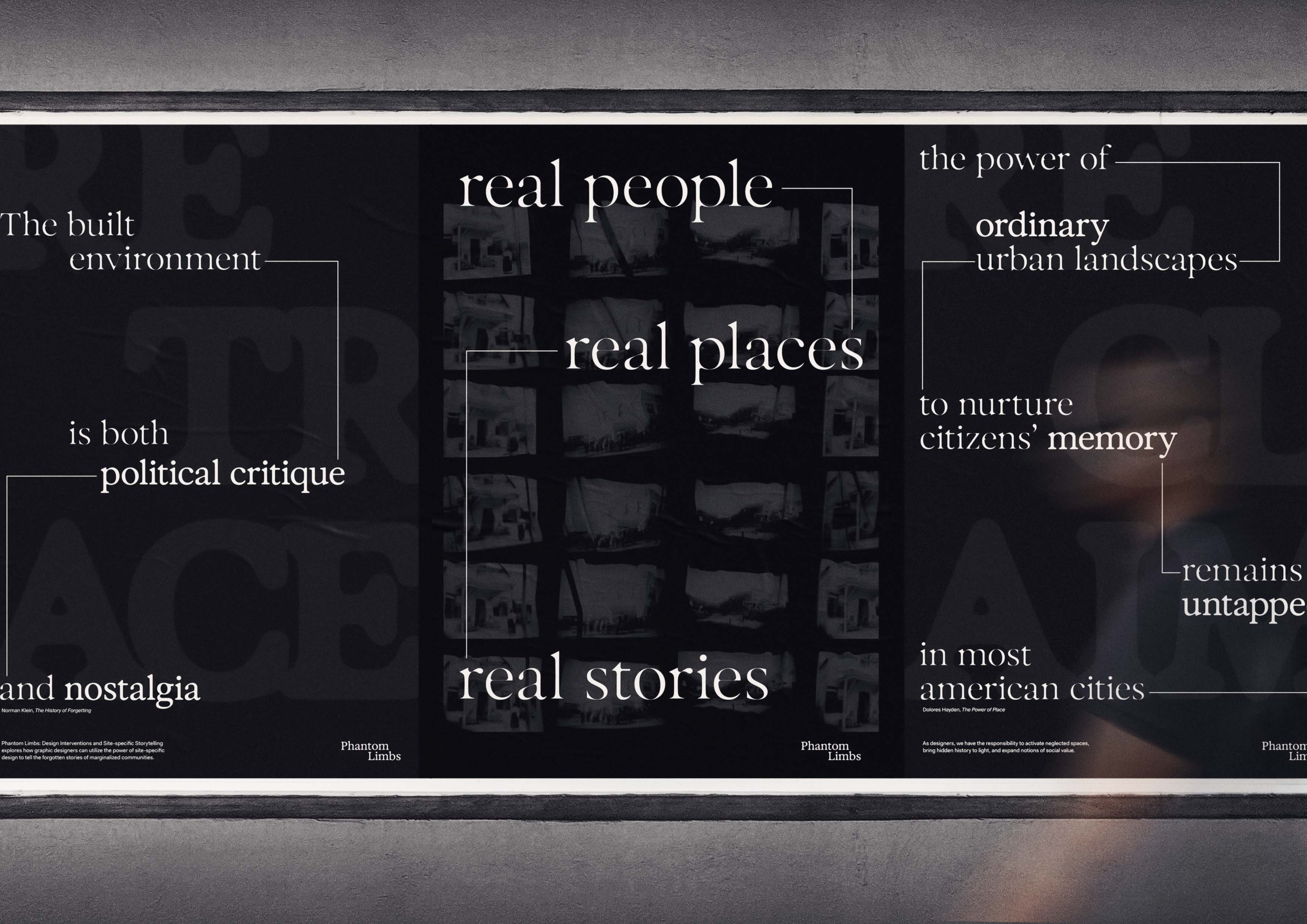
Phantom Limbs: Design Interventions and Site-specific Storytelling
MFA Thesis
Recognition:
Communication Arts 2024, Typography Annual Award
Communication Arts 2024, Interactive Annual Award
Graphis New Talent Awards 2024, Silver and Honorable Mention
PRINT Awards 2024, Design for Social Impact, Second Place
Creative Communication Awards (C2A) 2024, Honorable Mention
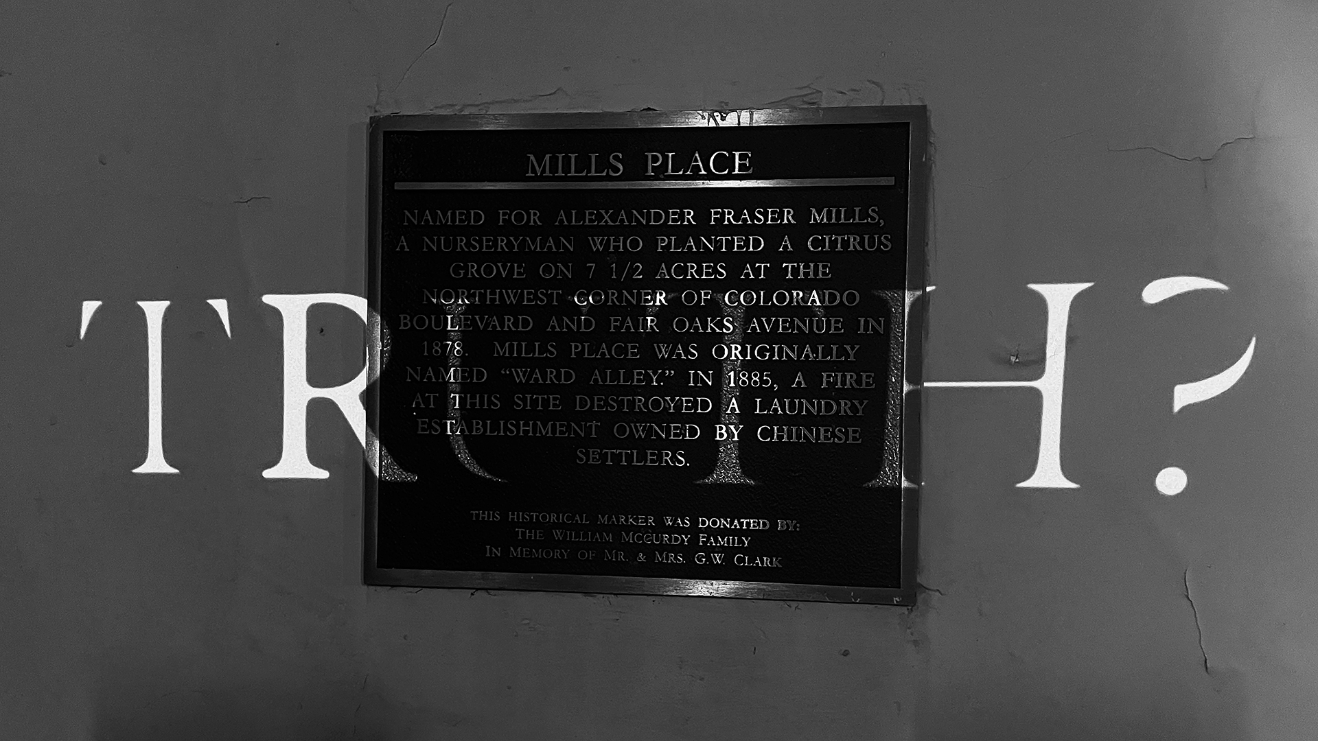
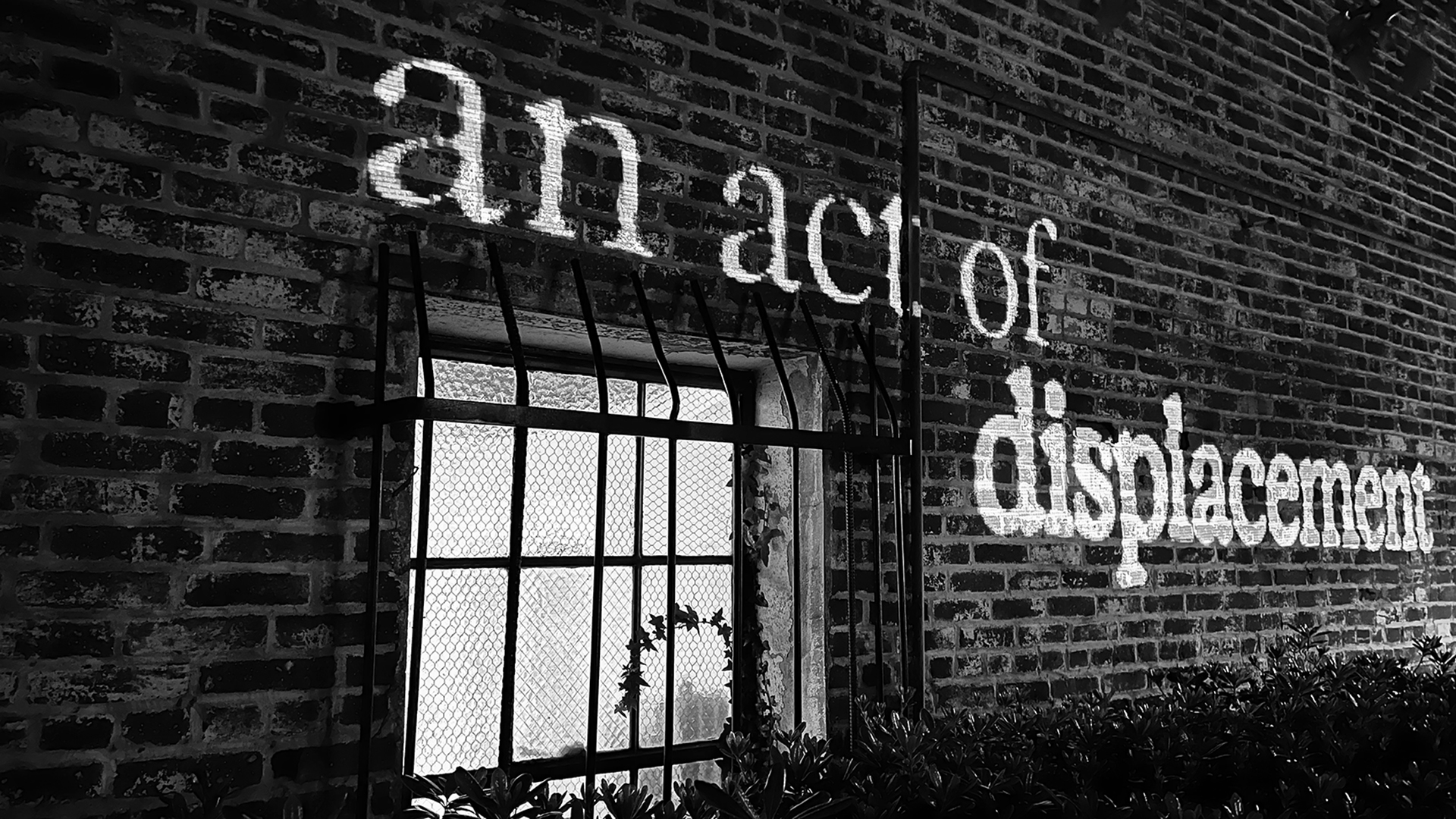
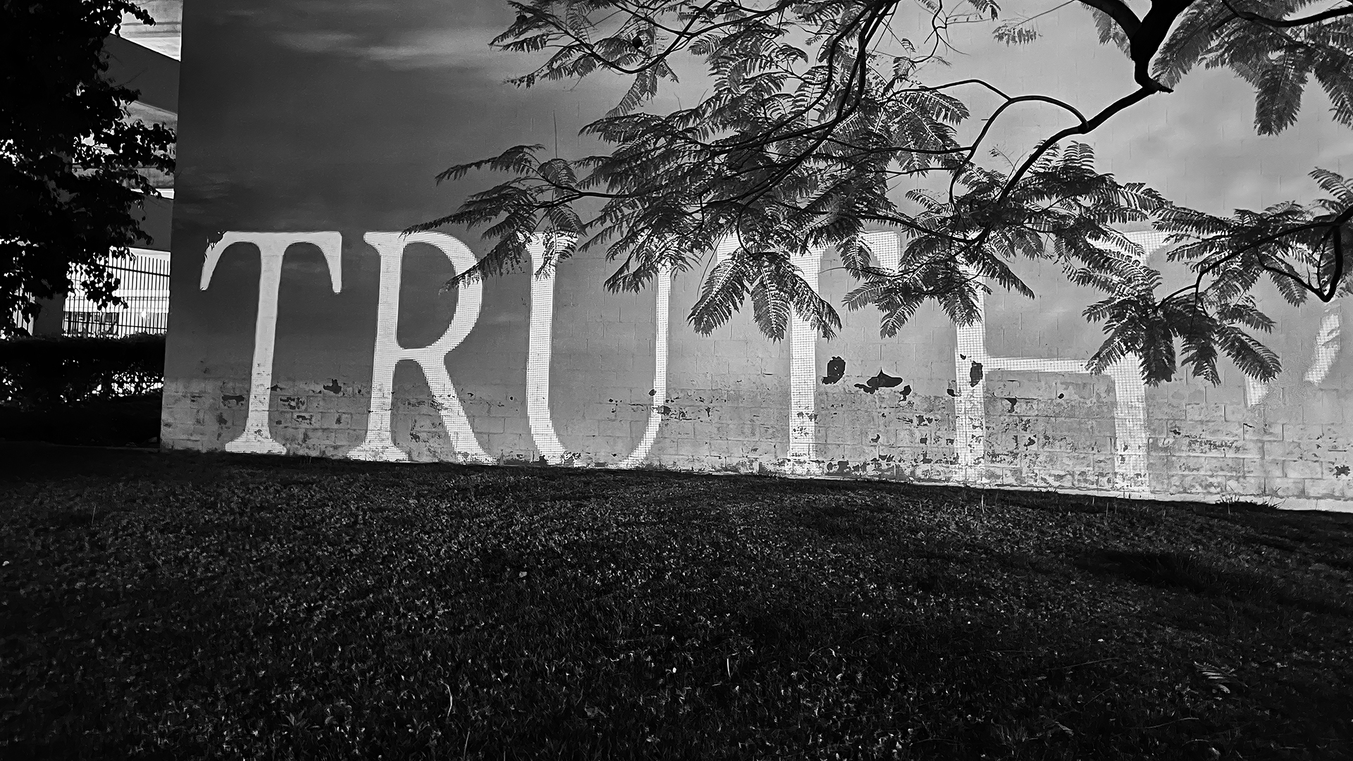
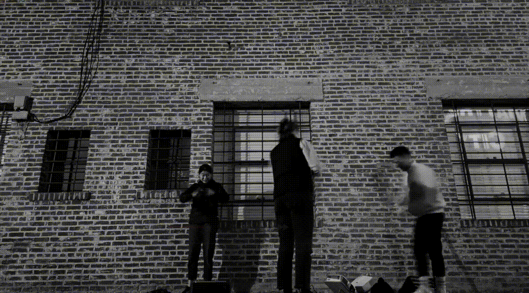
My master’s thesis, Phantom Limbs: Design Interventions and Site-specific Storytelling, explores how the power of site-specific design can be used to tell the forgotten stories of underrepresented communities. As designers, we have the responsibility to activate neglected places, bring hidden history to light, and expand notions of social value.
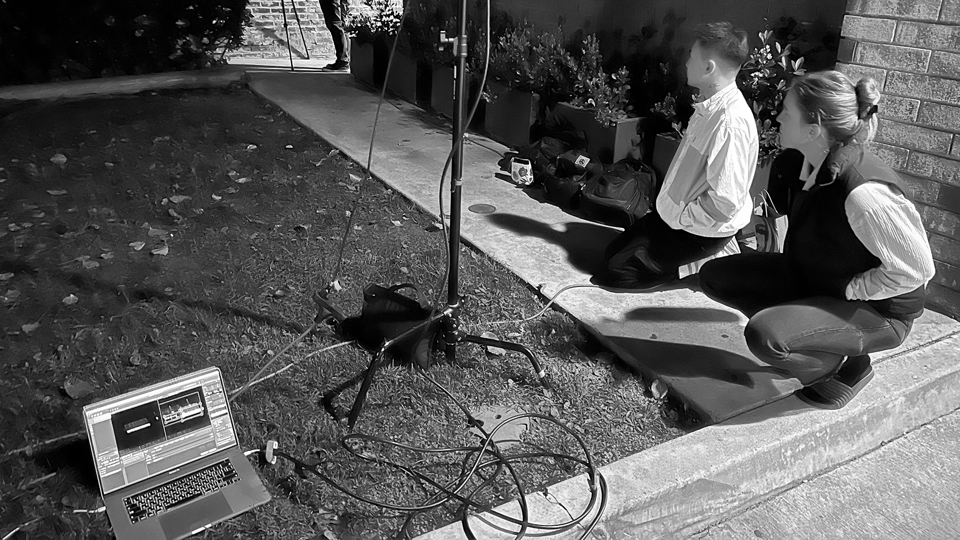
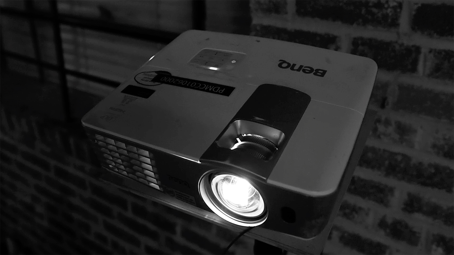
Focused on Pasadena, I selected several sites where displacements of communities, mainly working class people of color, occurred. I explored site-specific, projection-mapped environmental graphics at various scales by projecting statements, imageries, and other contents that speaks to the history of these sites.
My thesis has been shaped by my undergraduate studies in architectural history and urban planning, outdoor interpretation, and the pioneers of public art installations such as Barbara Kruger and Lawrence Weiner. By merging graphic design with other disciplines, its power and role can be enriched, making meaningful contributions to public history and the neighborhoods we live in.
French philosopher Michel Foucault talks about heterotopia, which are marginalized places that are removed rom our normal daily lives. Extrapolated from his definition, we can examine urban spaces through a similar lens. Underused spaces, such as alleyways and parking lots, usually serve little purpose. Pasadena has a lot of them. If utilized well, these “urban voids” can also become powerful places for storytelling.
Inspired by the principles and techniques of outdoor interpretation, which is a profession that focuses on outdoor storytelling, the environmental graphics I propose should provide more than just factual information. They should create opportunities for the audience to form their own intellectual and emotional connections.

The entire research, process, and personal reflections are documented in my thesis book.
THE POWER IN OUR SONGS
Book design, identity, creative coding
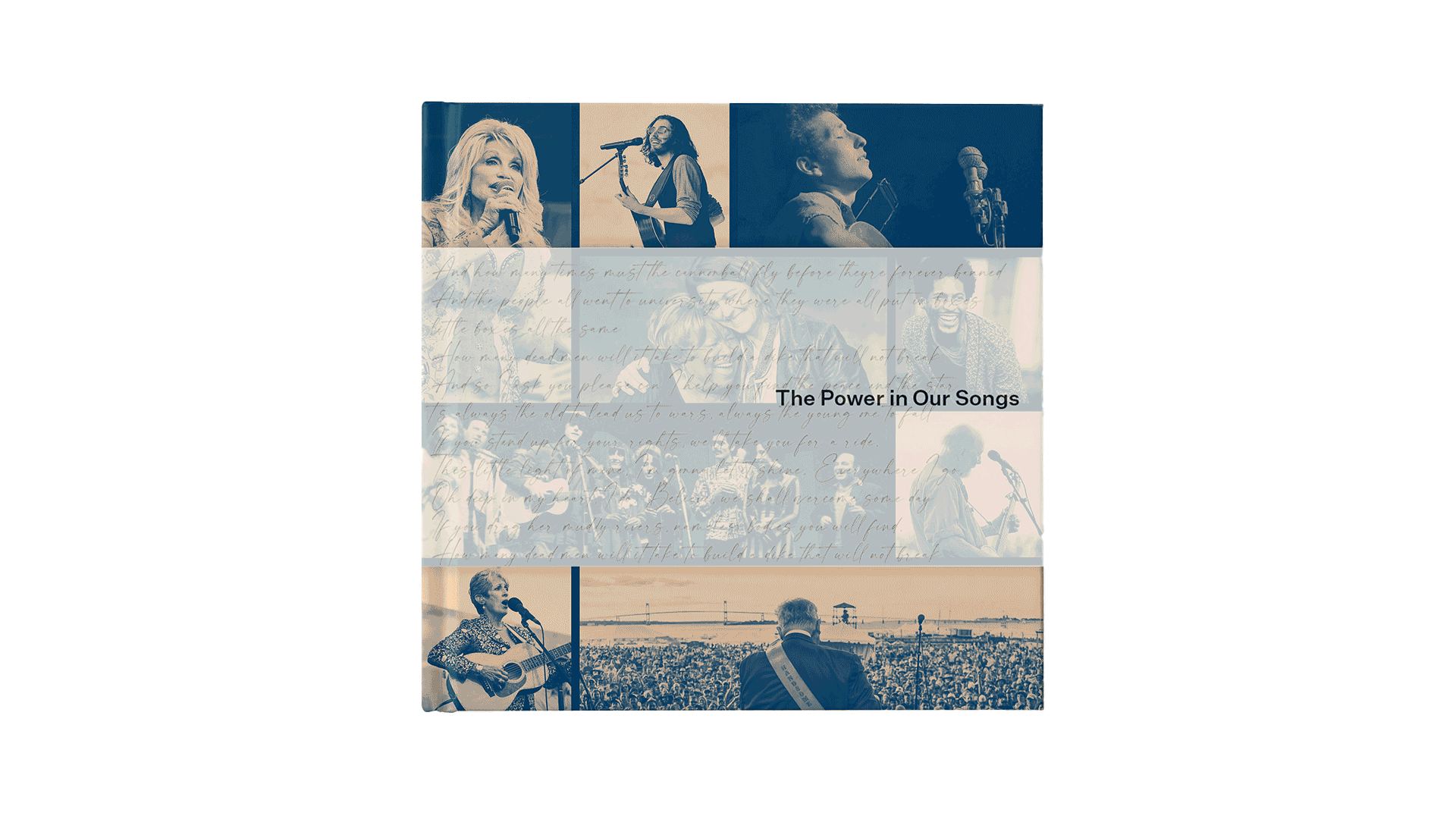
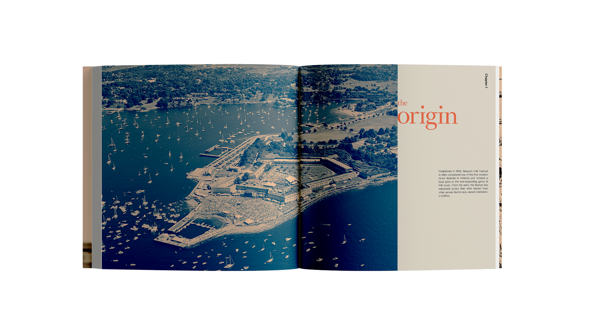
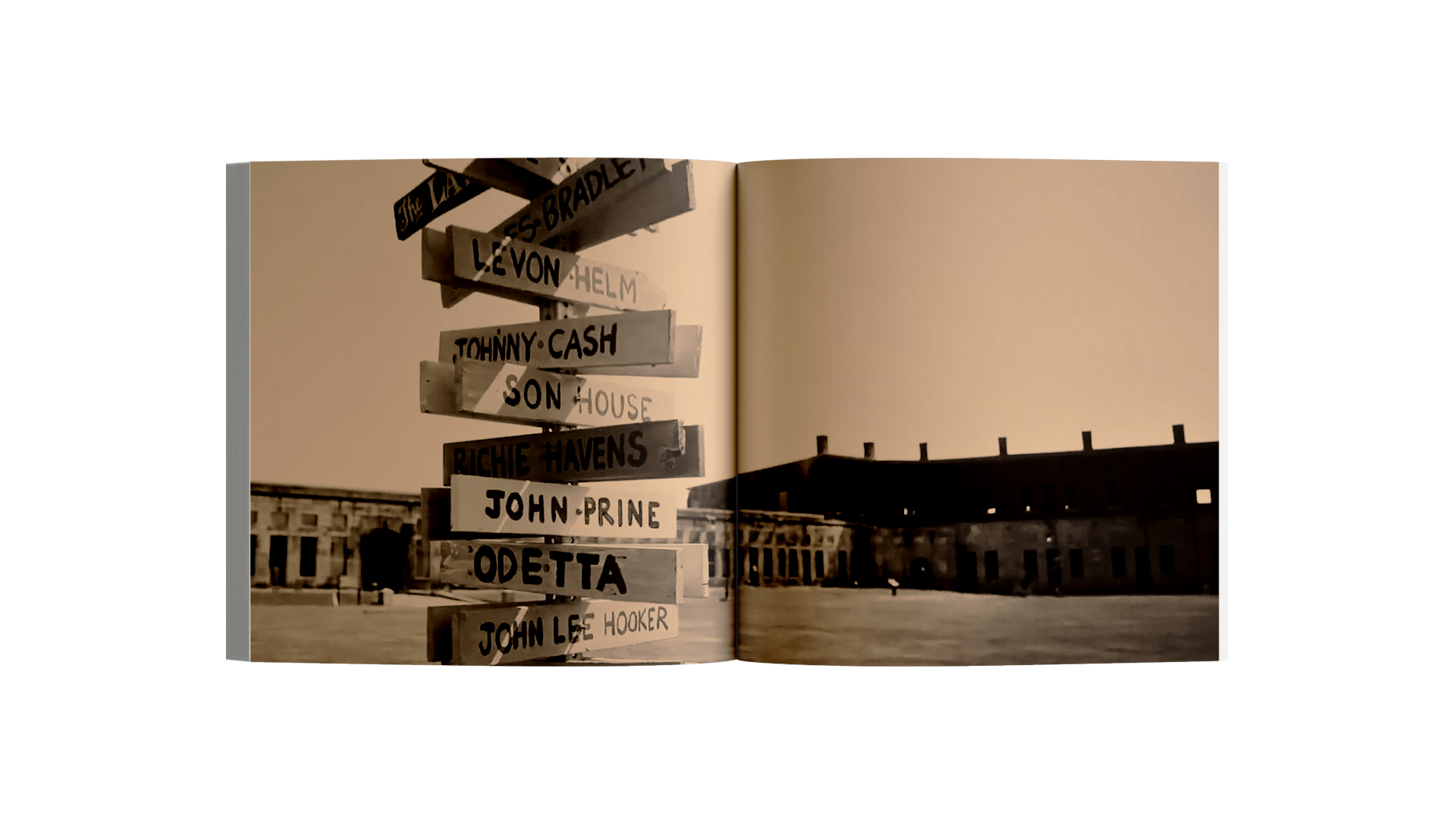
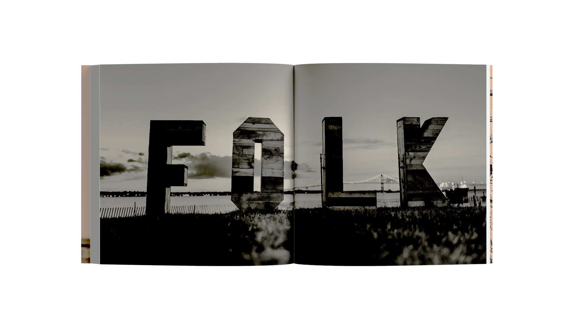
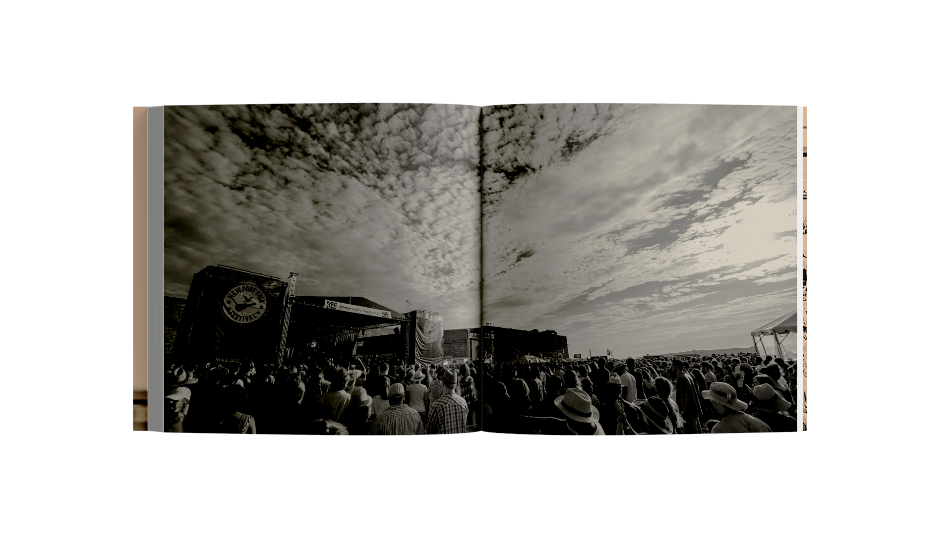
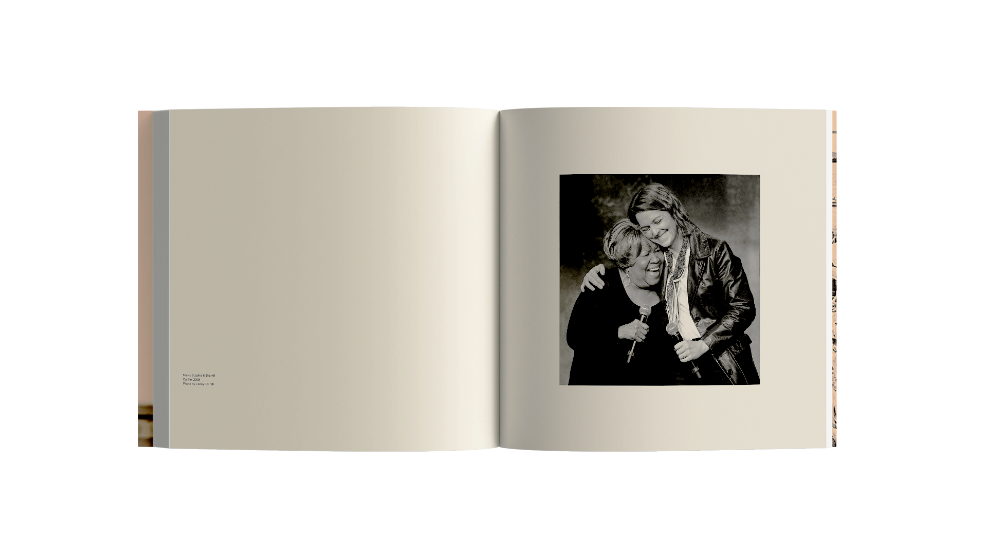
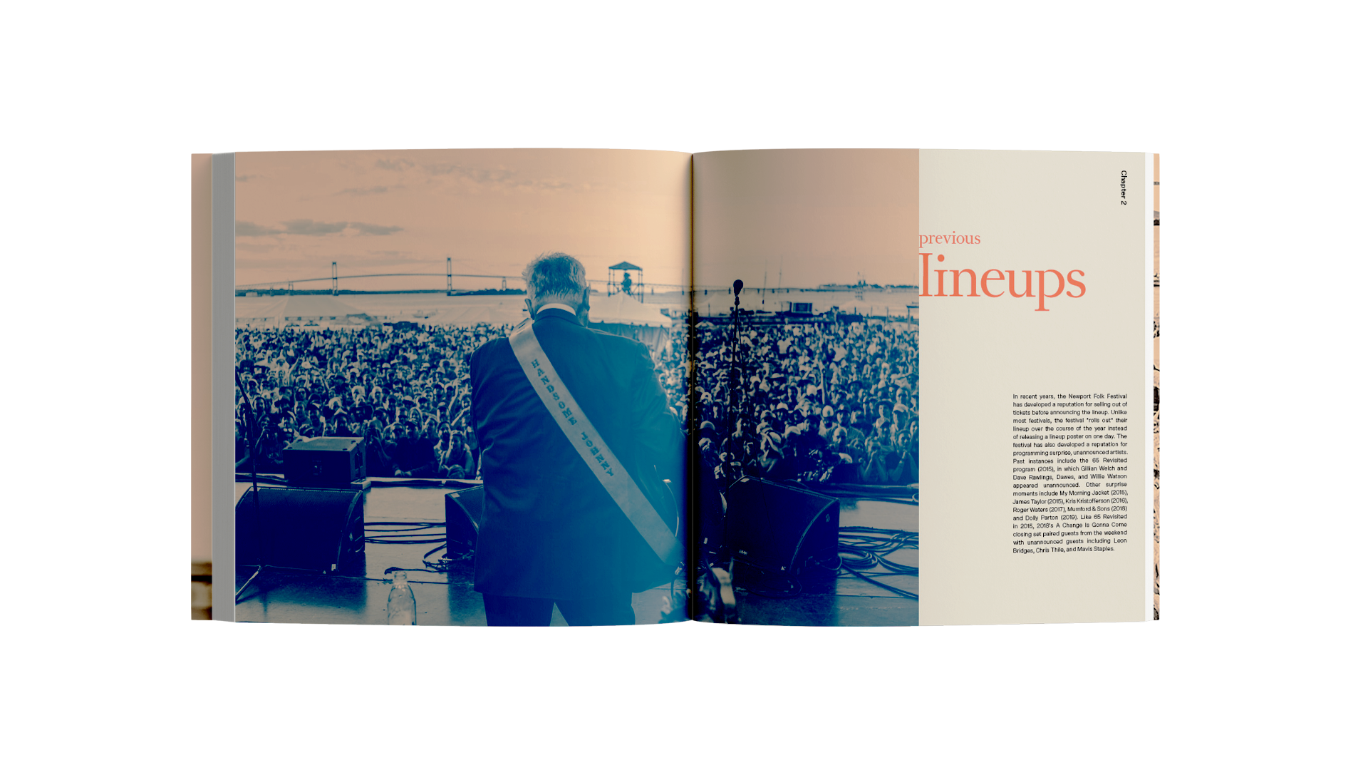
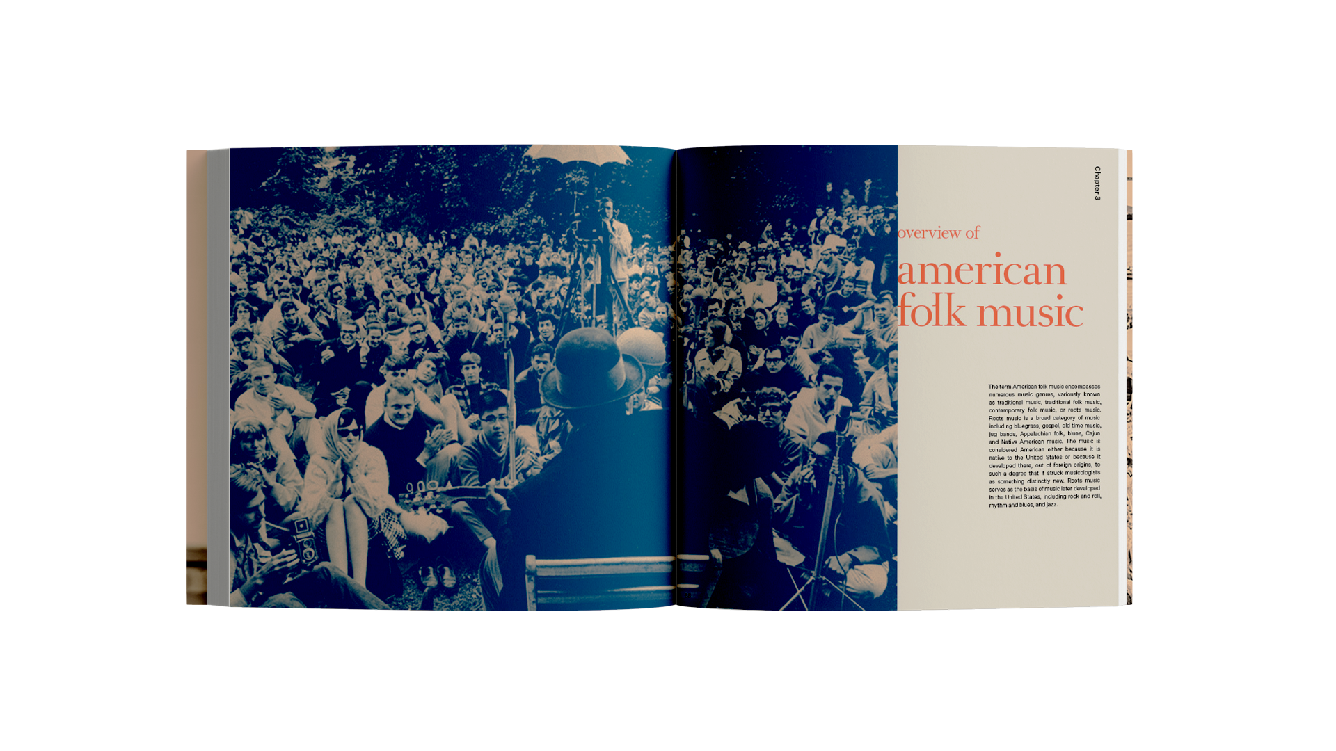
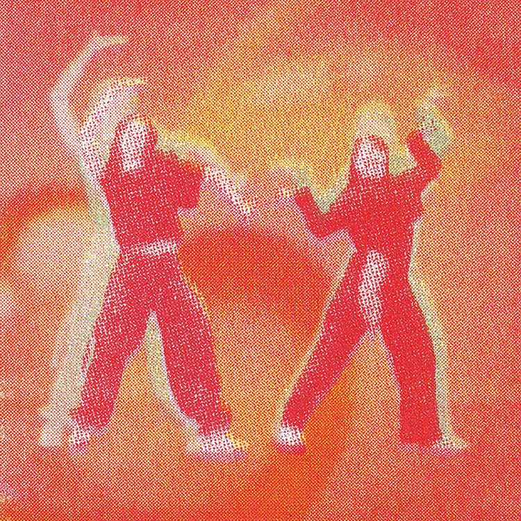
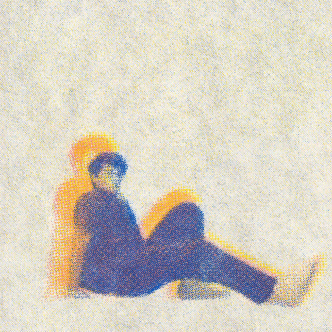
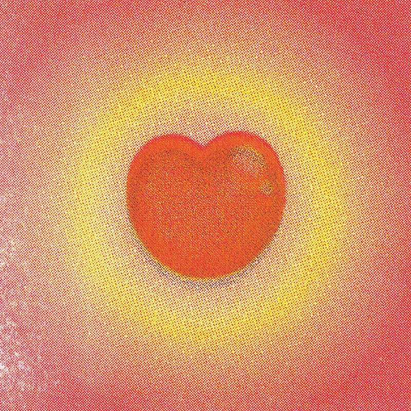
Designed for young folk music lovers, The Power in Our Songs is a hypothetical book and installation designed to consolidate, celebrate, and honor the legacy of the Newport Folk Festival, one of the earliest music festivals in the United States in Newport, RI. It has played a significant role in shaping American music history, yet there has not been a comprehensive work that documents it. This book narrates the history and the lineups from inception to the present day, the different genres of folk music, and the musicians who played significant roles in the 1960s during the Civil Rights Movement.
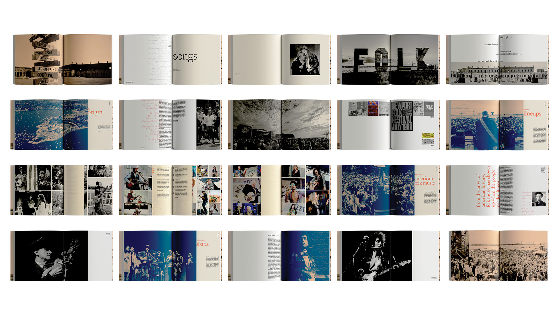
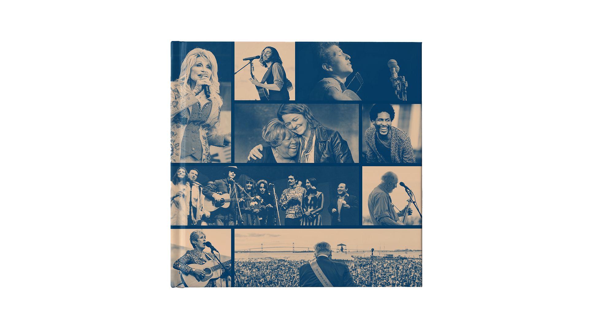

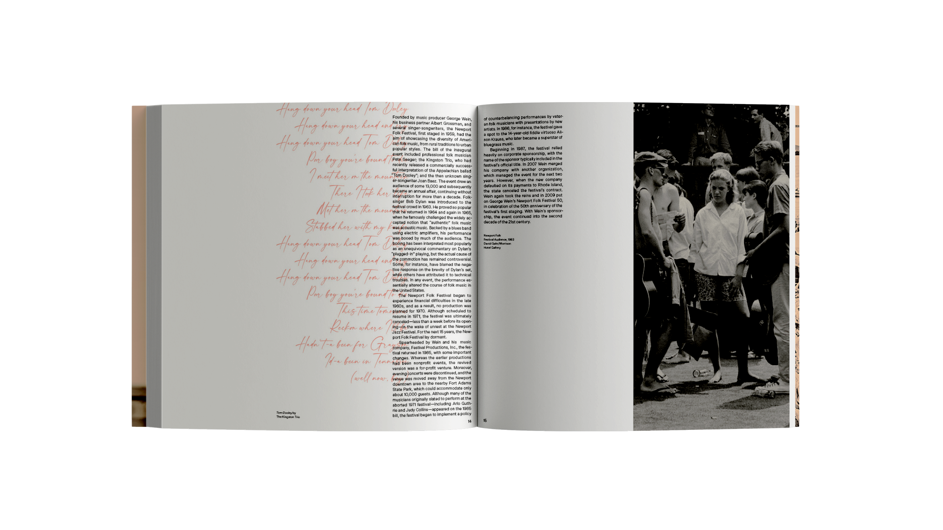
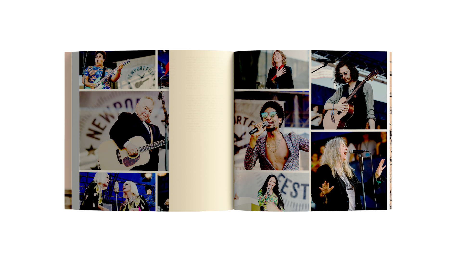

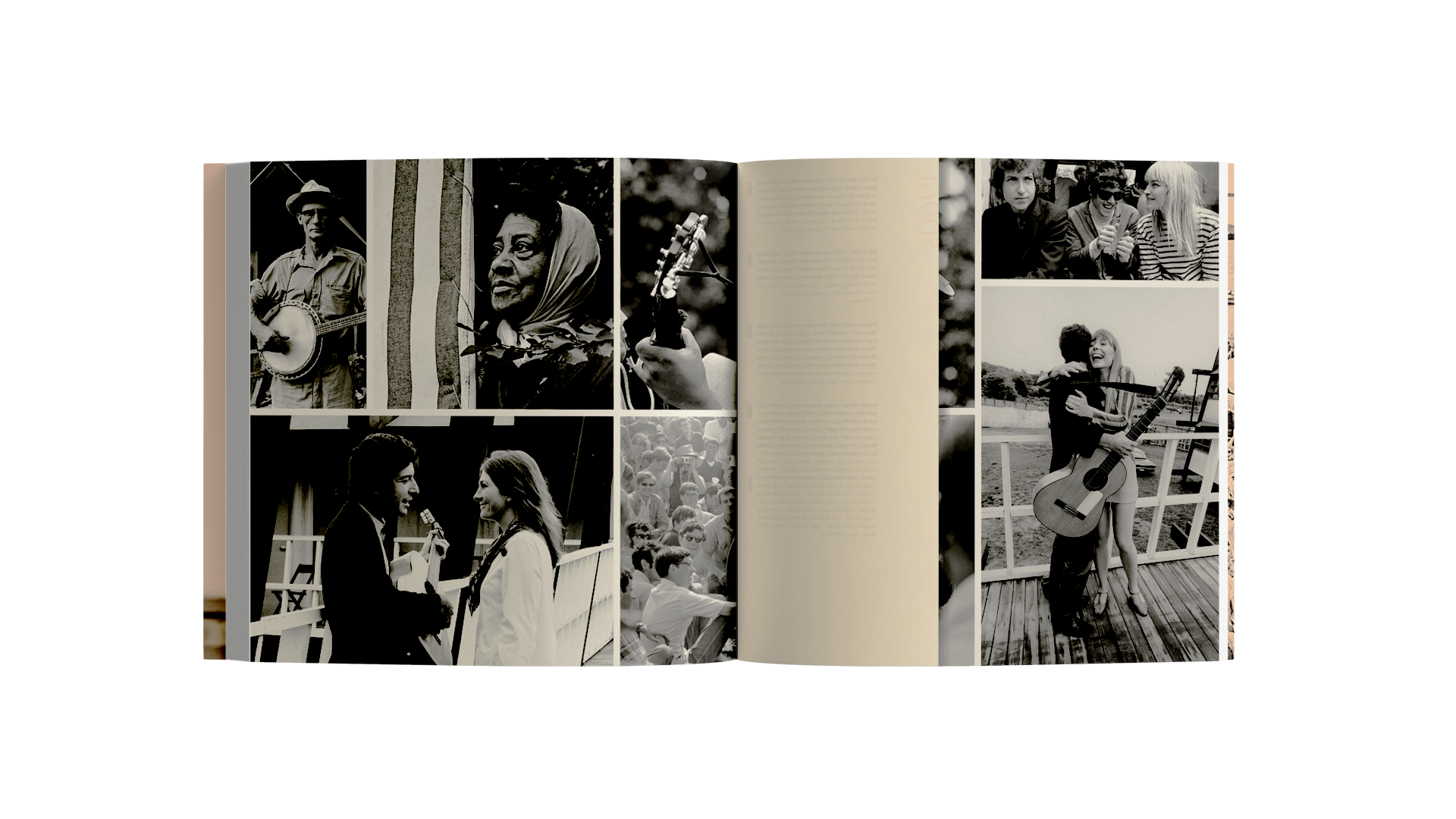
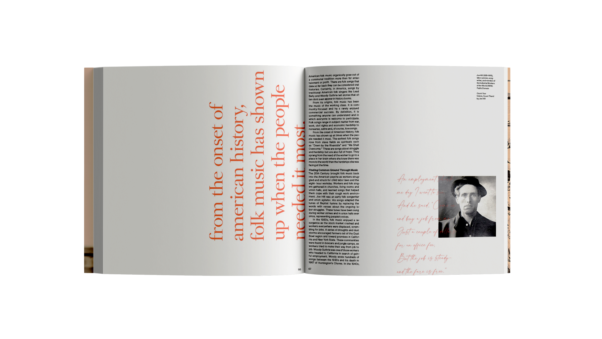

The handwritten typeface represents the analog quality and warmth of the lyrics. The orange and blue duotone image treatment represents the nautical setting of the festival.
In recent years, music festivals have started including interactive art installations. I designed a series of dynamic lyrics installations that respond to live music playing on stage.
Using p5.js, the dynamic lyrics form the portrait of the performers respond to the rhythm and amplitude of the music. The main challenge and accomplishment here was how to use code to create an analog look that goes well with the festival. The materiality and physicality of the installations allow the projections to interact with the nautical wind, light, and the human body.
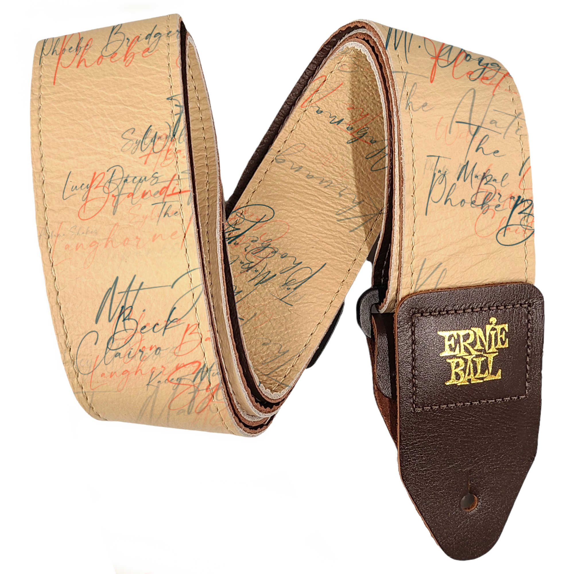
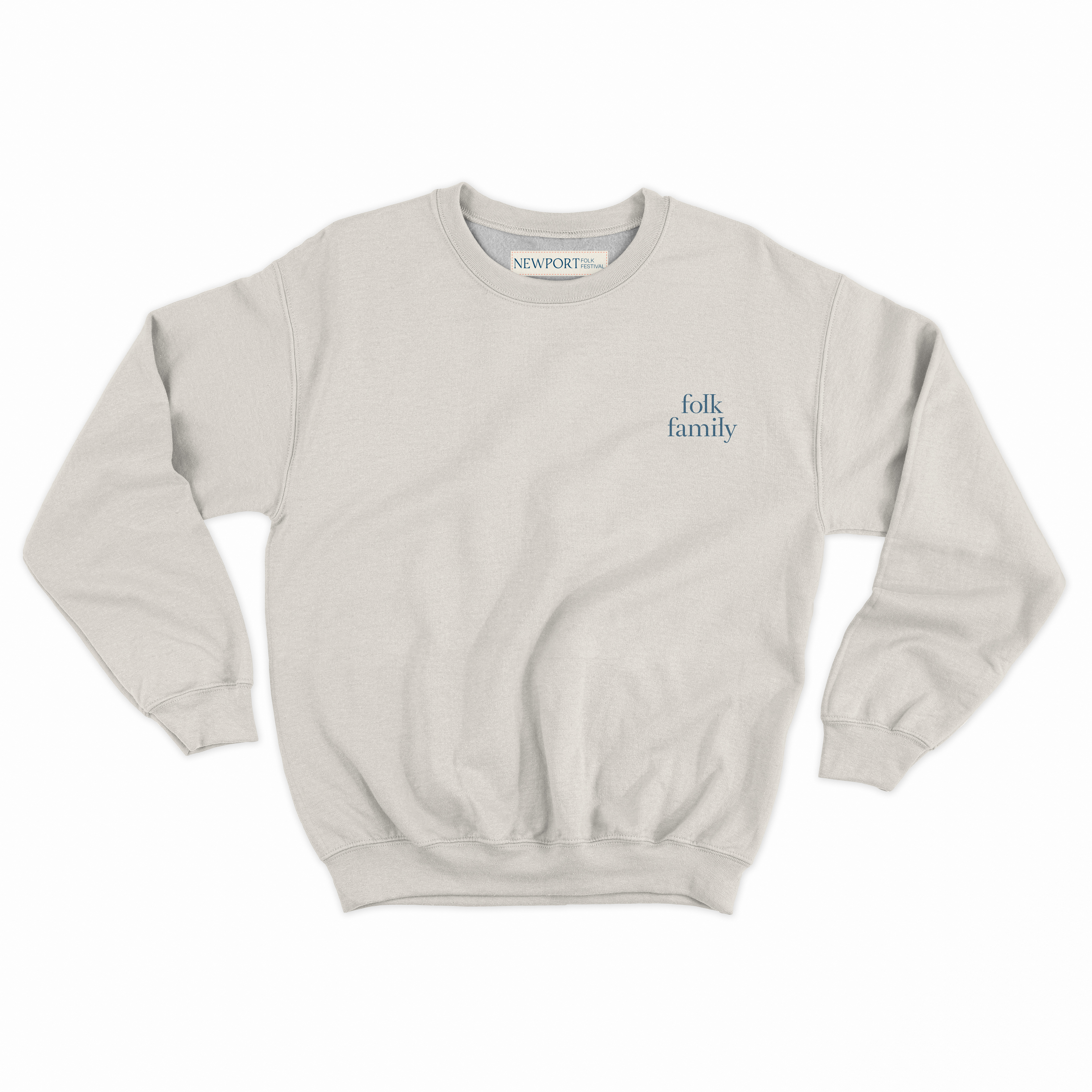


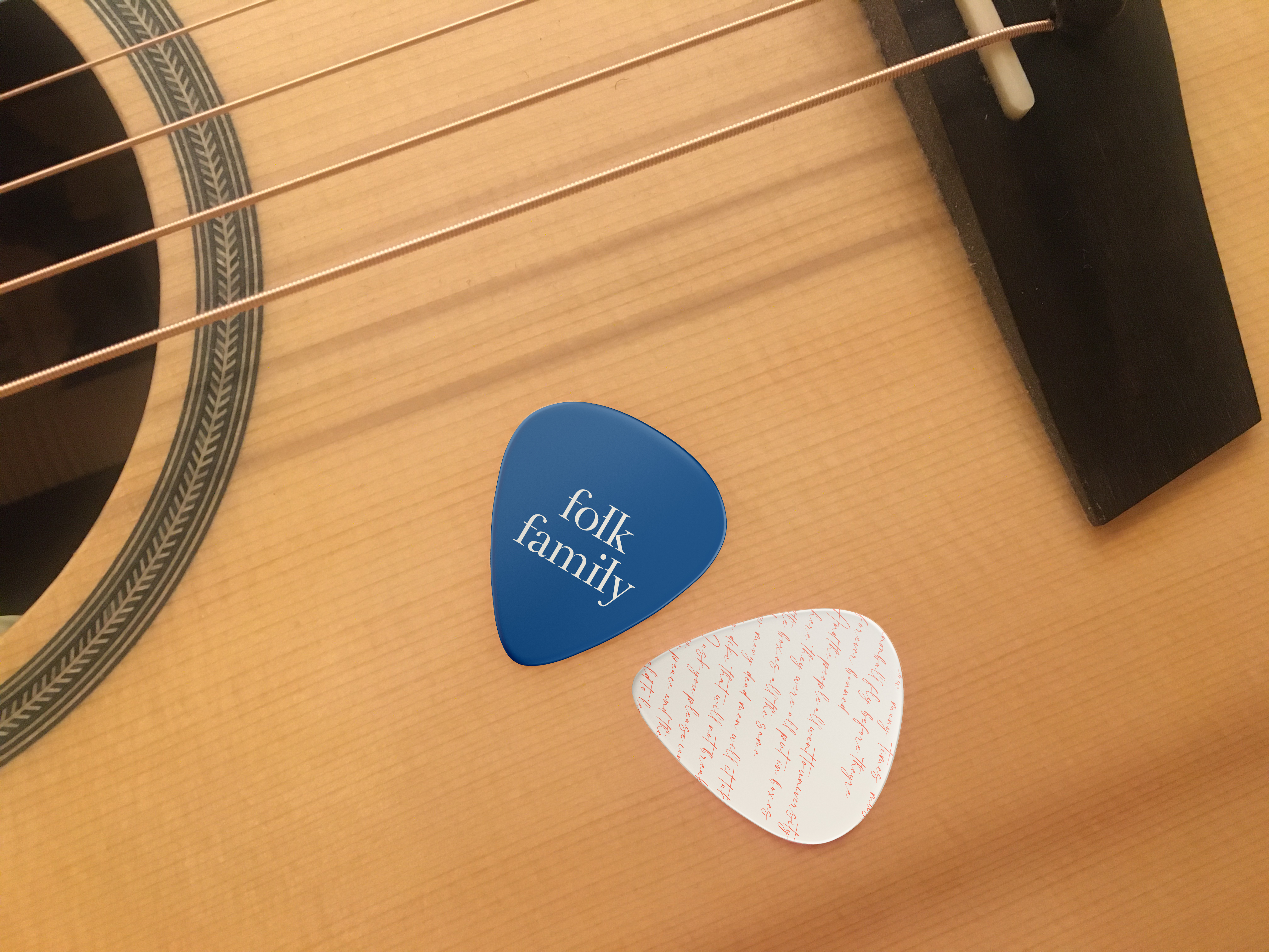

The same design language is used in different festival merchandise, creating a sense of warm and fostering the feeling of “folk family”.
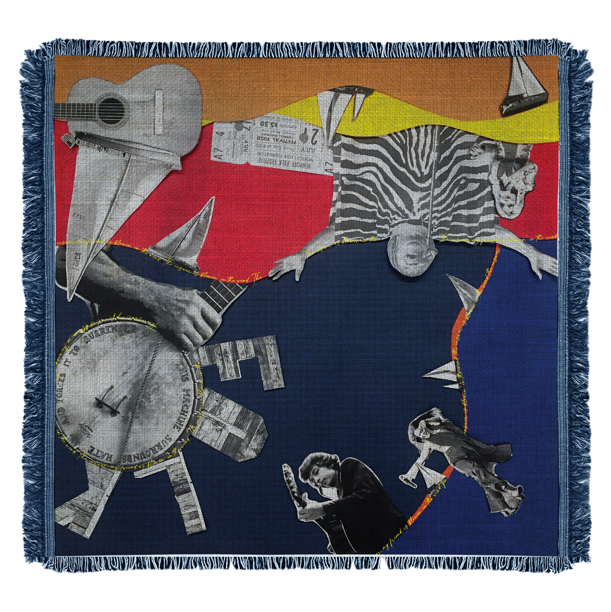
A series of throw blankets in the style of collage represents the layers of memories that the festival embodies. The playfulness, nostalgia, and warmth goes hand in hand with the festival.
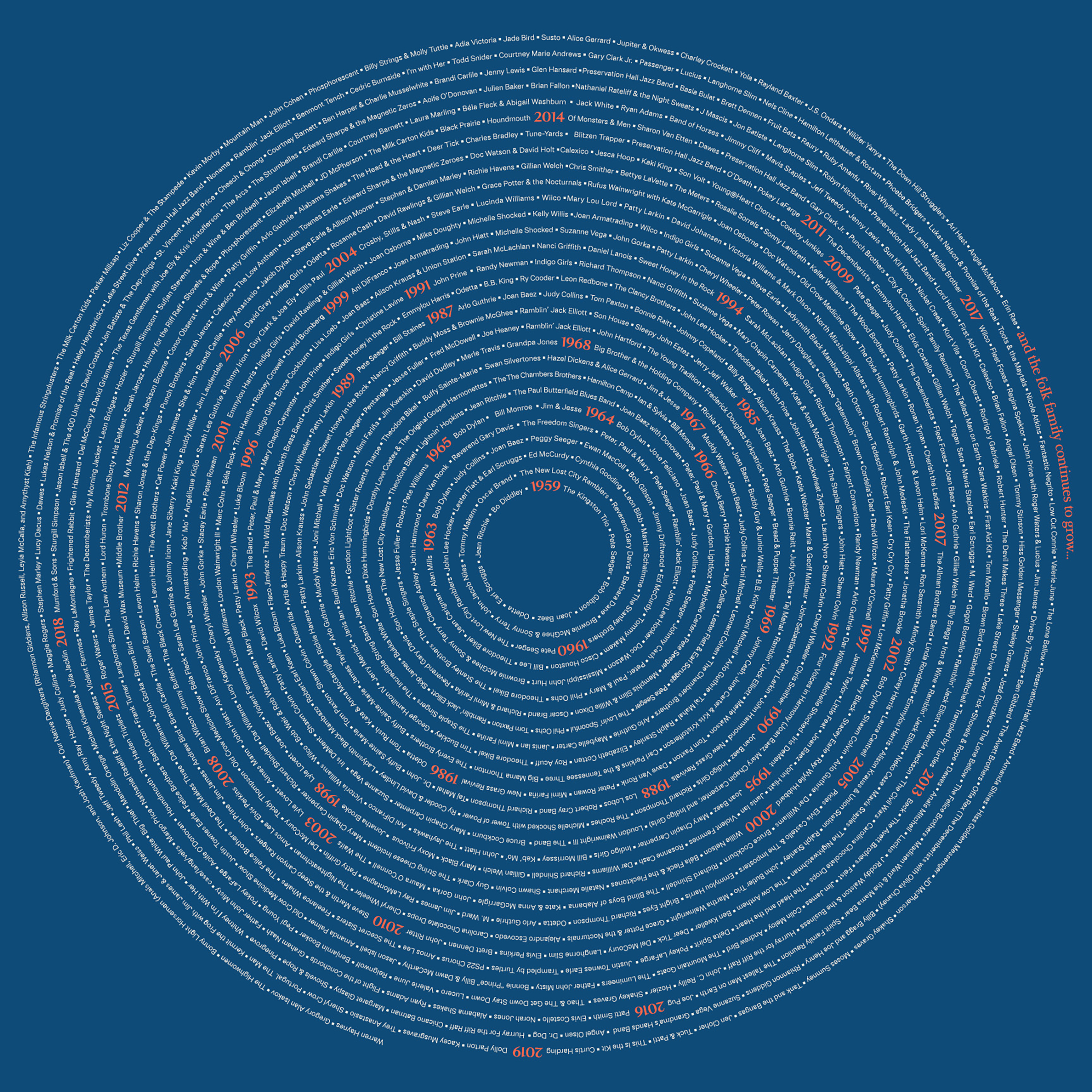
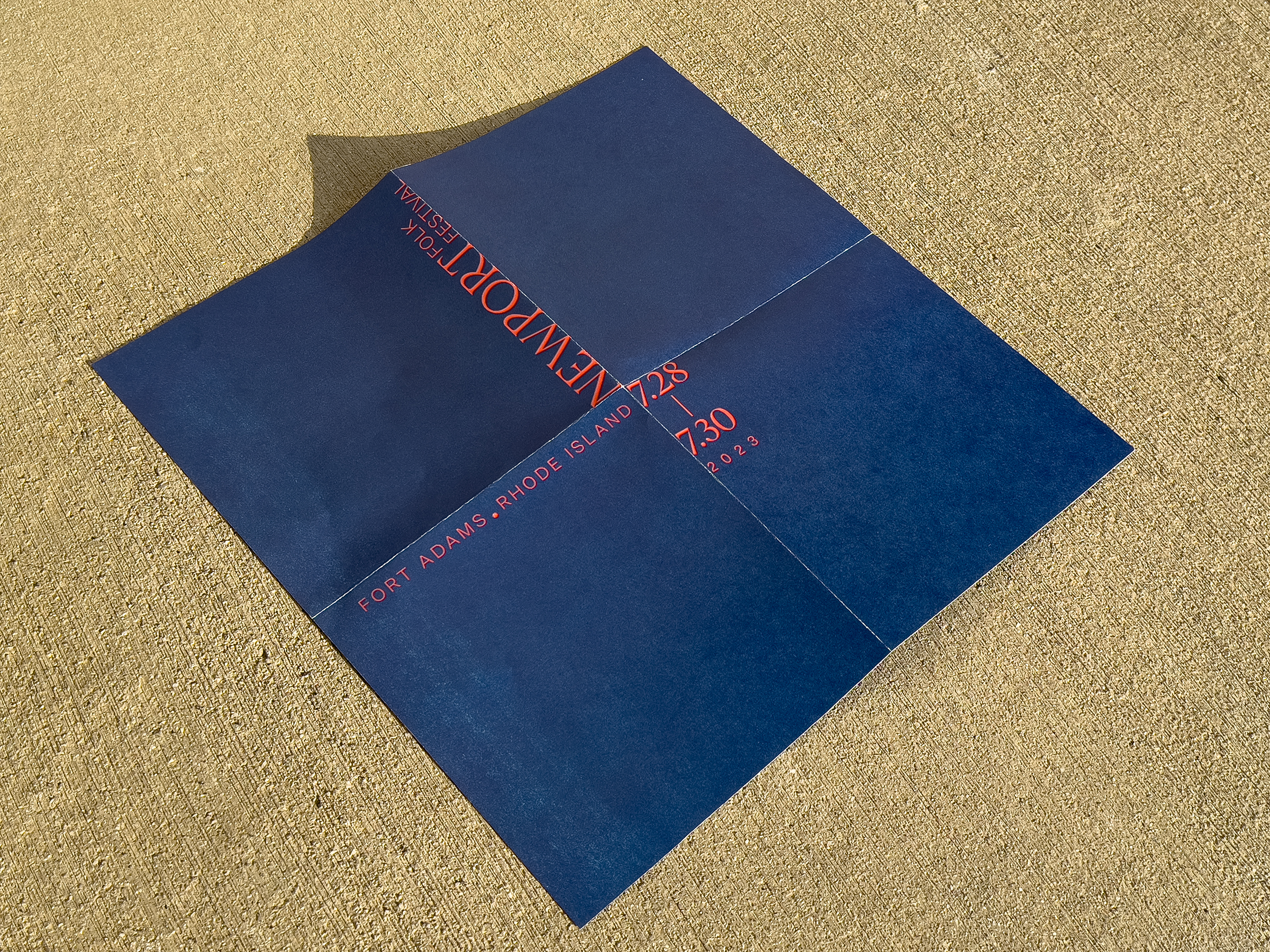
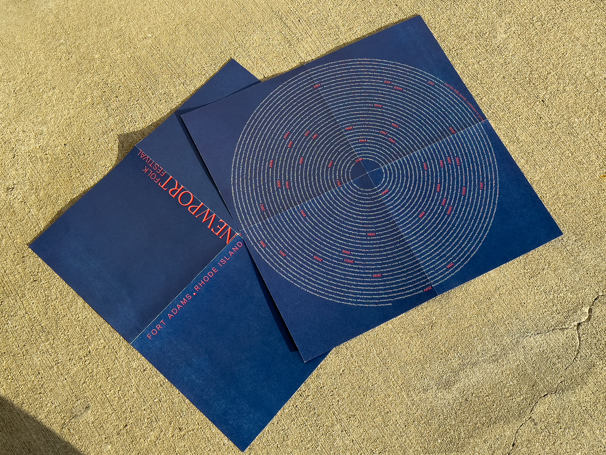
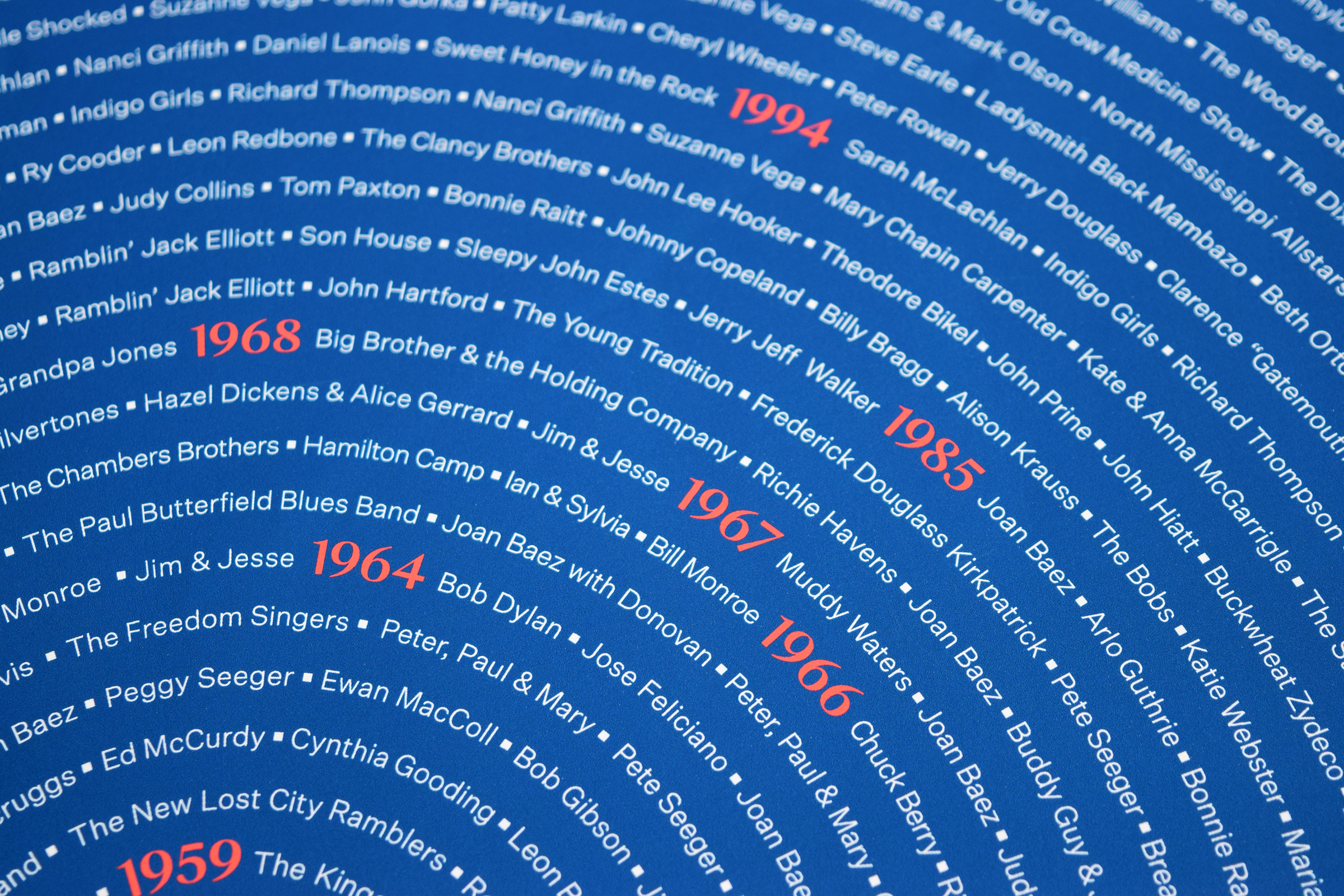
This poster is designed to be a double-sided insert included in the book. The front side features the lineups of the festival from its inception in 1959 to the present day. The back side features a minimalistic design of the festival’s information. The structure of the lineup is inspired by the shapes of vinyl records and tree rings. Since the festival happens during the summer right by the ocean, the use of blue and orange is meant to represent the setting.
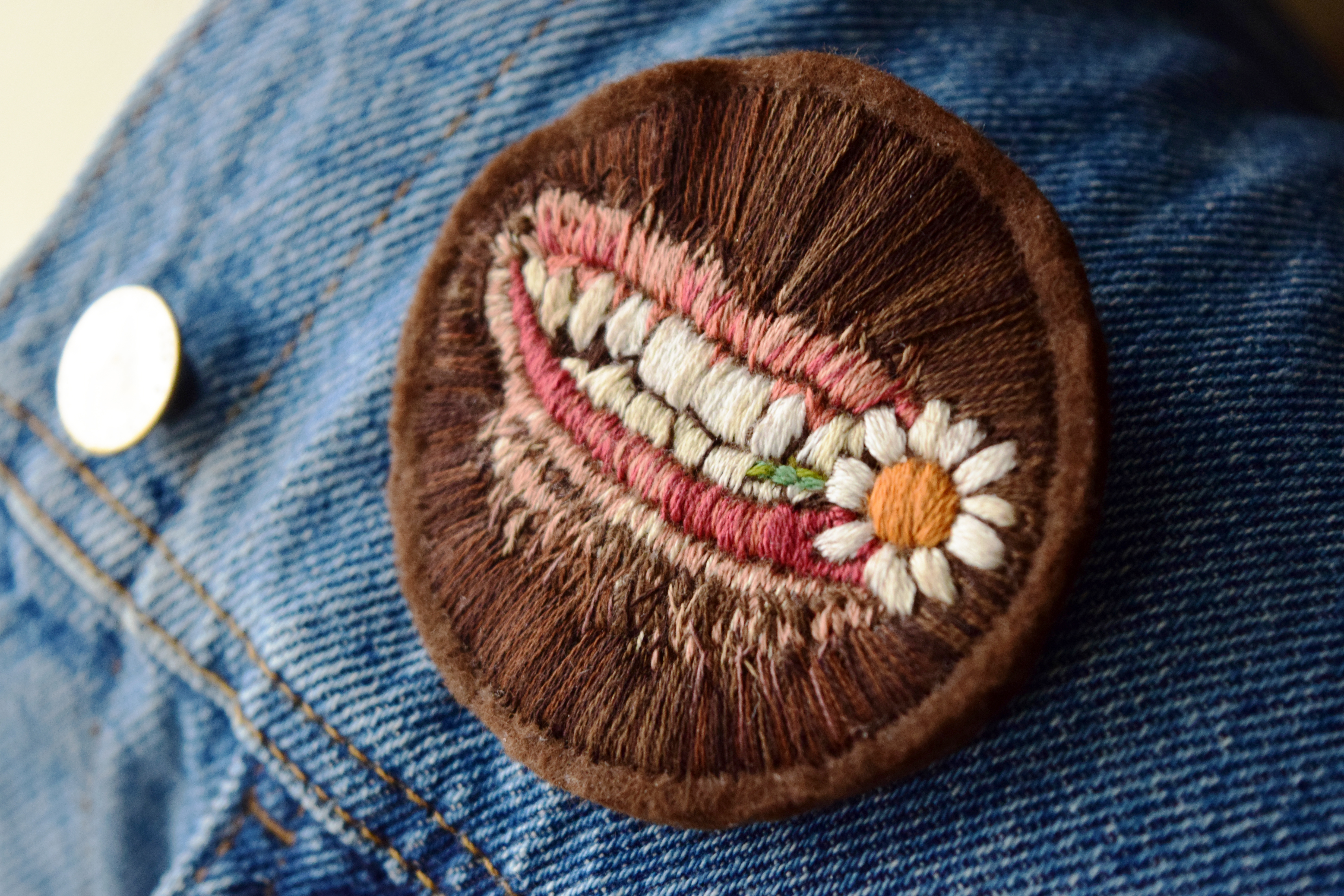

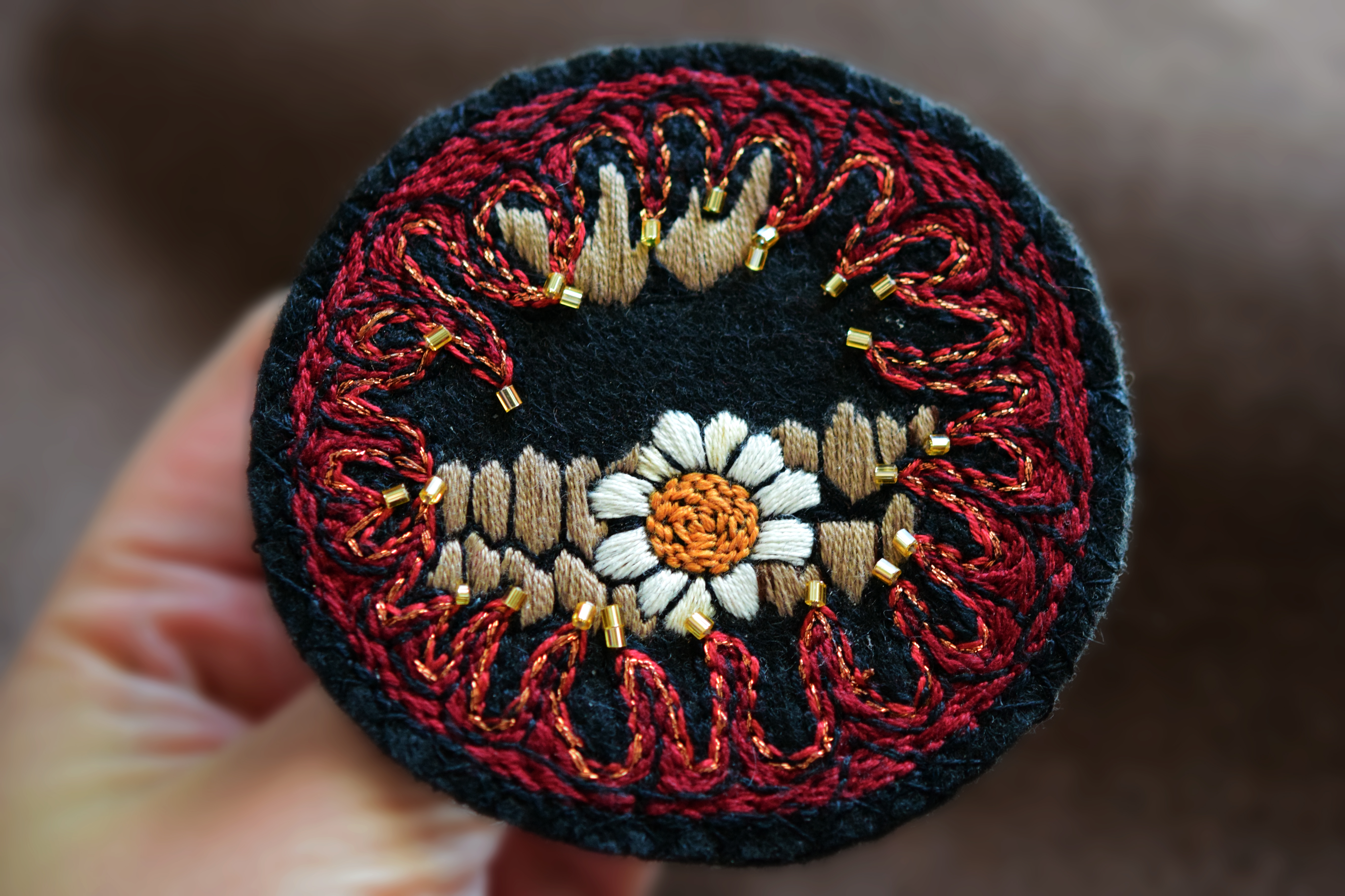
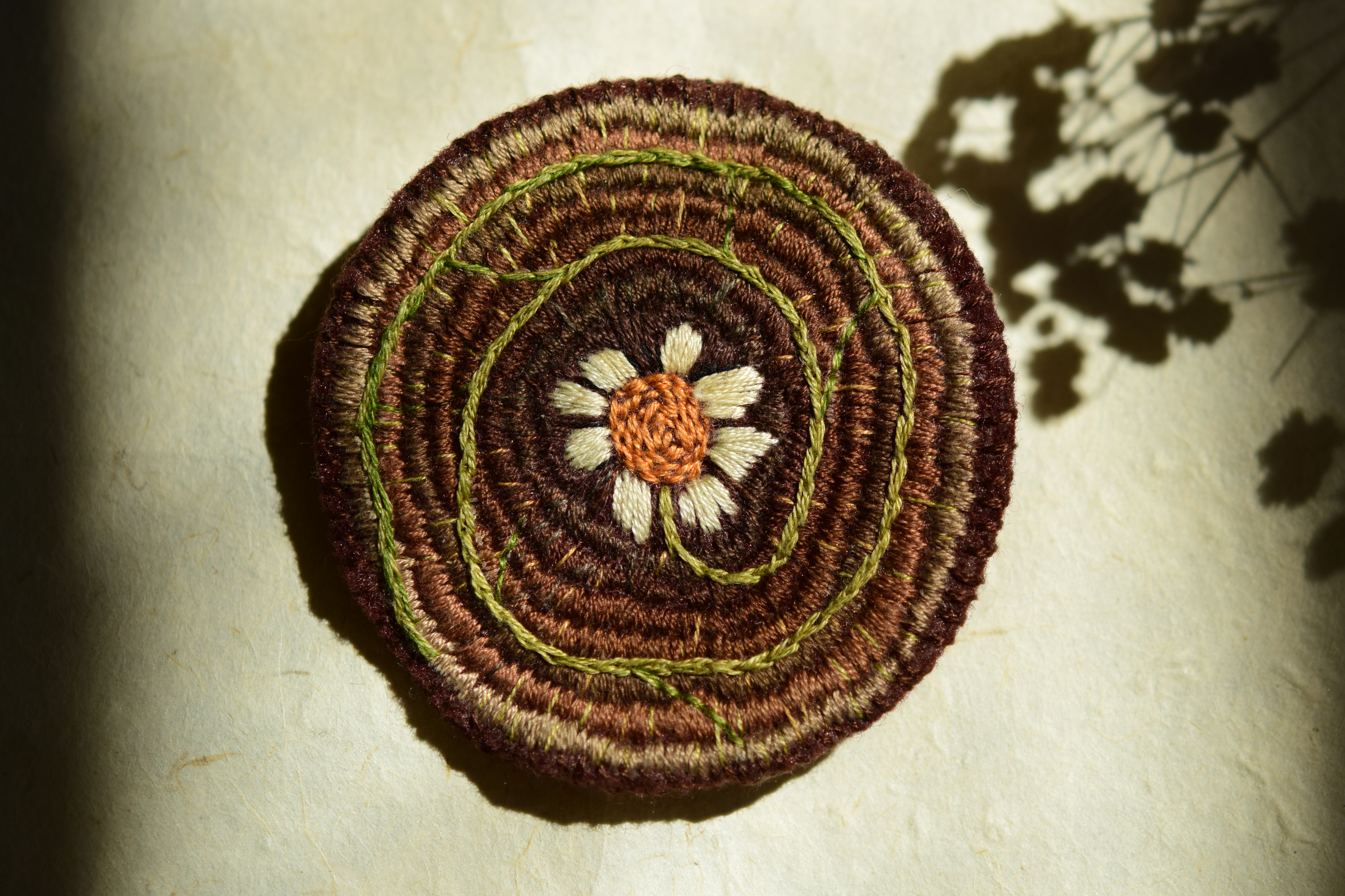
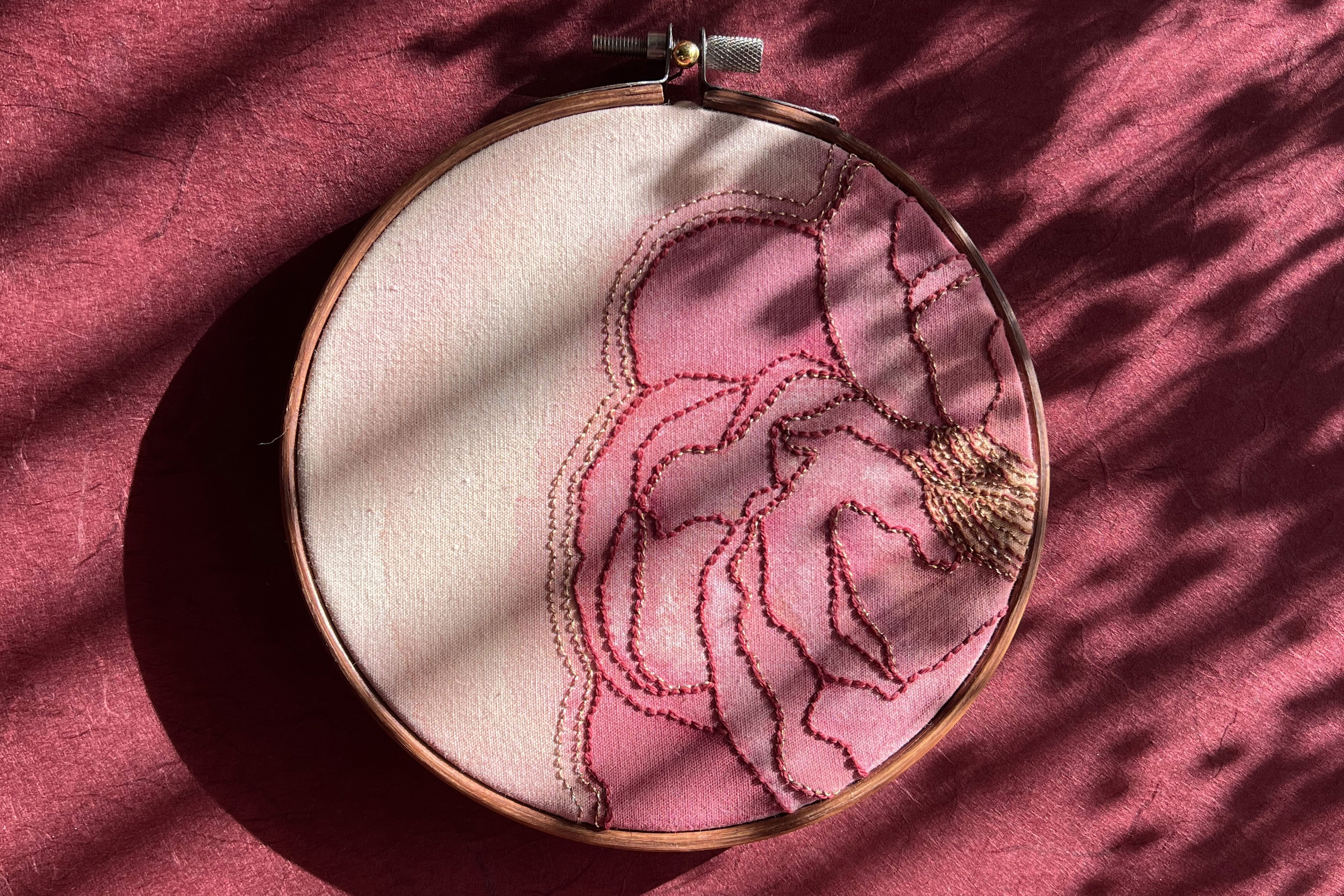
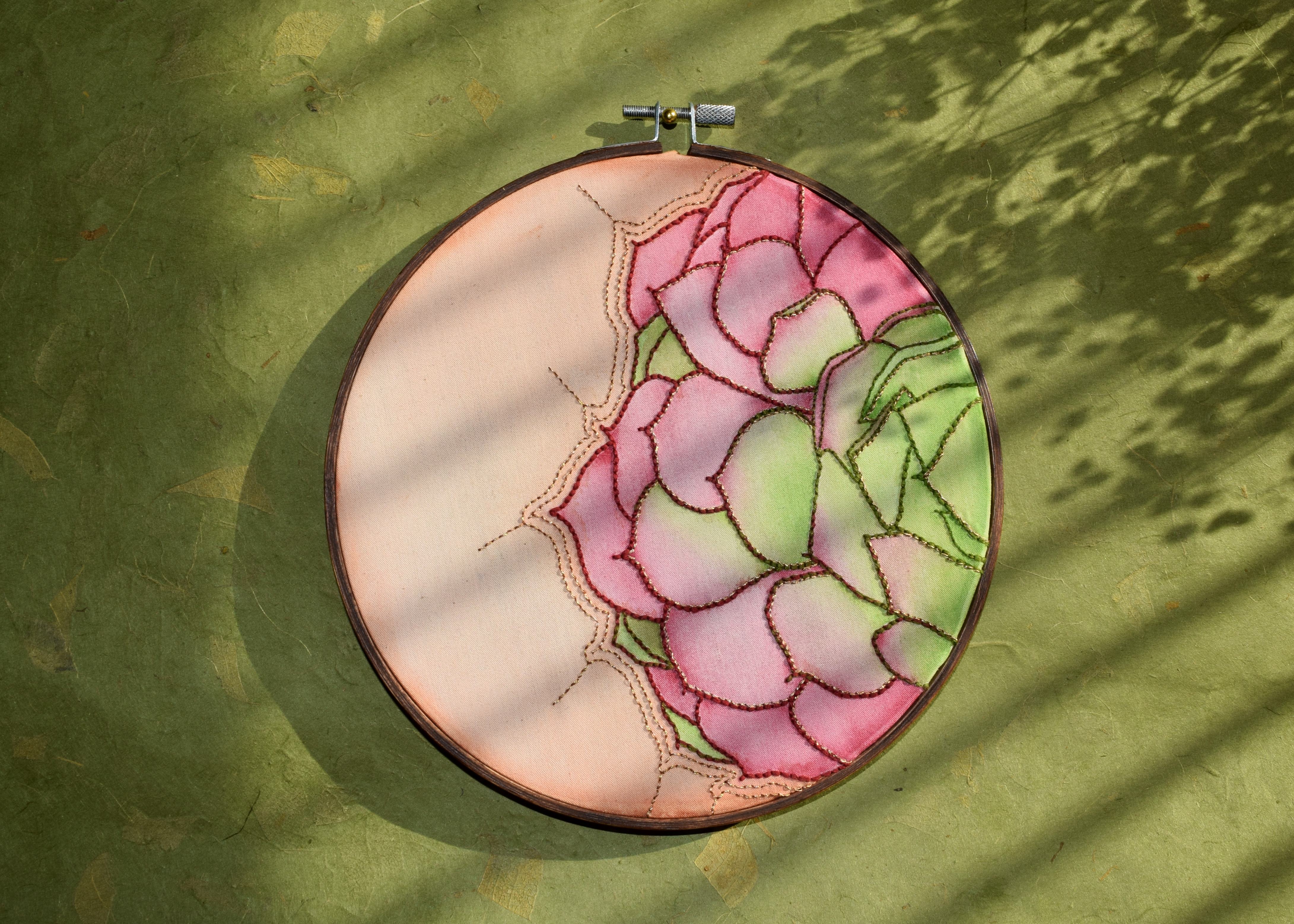
Embroidered brooch inspired by Hozier’s album Unreal Unearth. Hozier wearing my custom, hand-made patch at the Troubadour in LA. Photo by Cathryn Kuczynski.
Copyright MT / Use, reproduction or distribution of the Artwork is strictly prohibited unless expressly authorized in writing by MT or its Affiliates.